
As designers, it’s easy for us to prioritize aesthetics over everything. Does it look good? Consider it designed. But one of the most crucial aspects to good design is also one of its most easily-overlooked: accessibility.
What is Digital Accessibility?
That terms means a lot of things in many different contexts. A broad definition is “Digital accessibility refers to the practice of building digital content and applications that can be used by a wide range of people, including individuals who have visual, motor, auditory, speech, or cognitive disabilities” (via UX Collective). Accessibility in web design means prioritizing access for all web users, regardless of any impairments or atypical sensory processing.
As a UX designer, it’s our role to anticipate the scenarios our users might find themselves in, through every stage of interaction with our website. It’s imperative that we consider not just run of the mill UX scenarios, but the experience of using our website with a screen-readers, or experiencing visual impairments, or cognitive disabilities.
At the end of the day, a more accessible website benefits all users. It forces us to thoughtfully solve communication difficulties, and avoid shortcuts that seem flashy, but ultimately prevent users from all walks of life from enjoying a site to its fullest.
Why Does it Matter?
Accessibility is not a niche issue only needed on specialized sites. It’s a topic that affects millions of people worldwide. 1 in 12 men and 1 in 200 women suffer from color blindness, while 1 in 30 have low vision and 1 in 188 are legally blind. In total, 1 in 4 Americans has some kind of disability. To ignore or dismiss this wide segment of the population means we’re, consciously or not, discriminating against a group of people who, like all of us, require use of the internet to go through their day.
To ignore or dismiss this wide segment of the population means we’re, consciously or not, discriminating against a group of people.
But it’s not just an ethical concern. There are legal ramifications for ignoring accessibility. A California lawsuit against Domino’s Pizza on behalf of a man whose blindness prevented him from using their website and mobile app recently had his case returned to court after an early dismissal. And in 2017, a visually-impaired plaintiff sued supermarket chain Winn-Dixie because he was unable to use their website with his screen reader. The plaintiff won that case, setting the stage for potential lawsuits to come.
Not to mention, excluding a large swath of the population from using your website directly eliminates a potential customer or client base. And less accessible websites tend to rank more poorly in search engines, which means users might not find your website to begin with.
How Do We Design for Accessibility?
Luckily, there are a wealth of resources to guide you in making design decisions that serve all web users. A list of requirements can be found on the W3 site. WebAIM is an invaluable resource, and their key principles article touches on the most crucial tangible aspects to keep in mind.
Consider creating a checklist of these and any other relevant requirements at the beginning of the design process that you can return to through each phase of a project. That way, you’re aware of potential accessibility problems from day one, and don’t need to search each time for a list of the items you’ll be tackling.
Solving for accessibility challenges often seems like at best, a hurdle, and at worst, a headache. But it doesn’t have to be either.
What’s crucial is to start solving for accessibility at the beginning of the design process.
By waiting to check accessibility standards until a site is nearly finished or worst, post-launch, designers write in more trouble than is needed, and often wind up marking accessibility compliance as “good enough.”
What’s crucial is to start solving for accessibility at the beginning of the design process.
And you don’t have to go it alone. The internet is replete with tools to help you integrate accessibility into your designs from moment one, broken out here at the end of this article (and going into even further detail in a post of ours from last year!).
Some things to consider as you design:
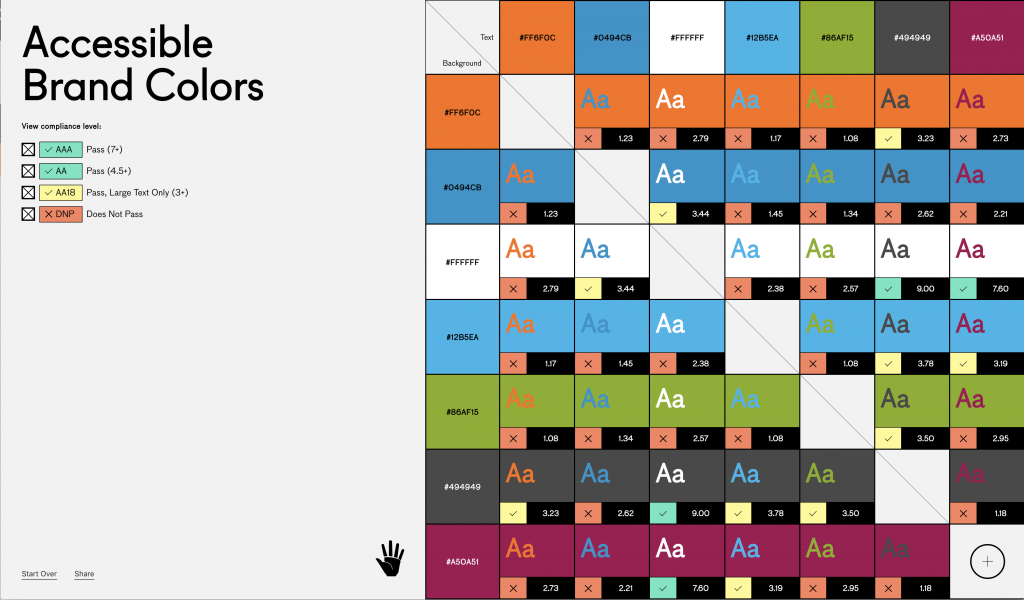
- Are your brand colors accessible to begin with? Designers working for a client are often provided with a set of unchangeable brand colors. But, many colors can easily pose a challenge to color contrast scenarios. For color-blind and low vision users, color contrast is crucial. Run a test on your brand colors before designing on a site like Use All Five to see which colors play well on each other. Look at this example from a recent website we designed. By viewing all the colors as both text and background simultaneously, you can plan out sitewide color schemes and hover effects. While many of these colors look nice together, they create color contrast issues when one is one top of the other. To solve this, consider either adding additional colors, emphasizing the colors that work most contrastingly together, or using brand colors on black or white backgrounds for improved accessibility. This is an important element to start the design process – if your designs have contrast, your final web product will as well. Use a tool like Adobe XD’s Stark to help ensure your design phase is accessible.
- Go beyond color to convey information: Consider that elements like red warnings, color shifts on hover, or subtle gradients may look nifty, but are relying on ways to convey information that won’t be useful for all your users. Instead, think innovatively – let your text carry the weight for conveying content, and rely on elements that don’t alienate users, such as scale, proximity, and symmetry. Go back to the basic principles of design, regardless of print or web.
- Emphasize hierarchy, and don’t skip headers for the sake of visual emphasis: Again, the key is going back to the roots of good design. Header hierarchies provide users employing screen readers with crucial information about the structure and priorities of a page. Avoid using headers in place of styled text – say, placing an H3 above an H2, because you feel the look of the H3 best suits the visual look of the page.
What About After the Design Phase?
Once you’ve nailed down the visual look of the site and built out your first versions, let the testing begin! Consult the above list of priorities, and make sure you’re testing at multiple points. The earlier you’ve solved a challenge, the better! Use testing tools like the newly-updated WAVE report to make sure that your site is meeting its goals in the Alpha, Beta, and pre-launch phases.
Summing Up
As designers, we are first and foremost visual communicators. It is our responsibility to communicate effectively with all our users, without discrimination or alienation. By doing so, we open ourselves up to new opportunities to creatively problem-solve, and help make technology accessible to all users, regardless of impairment, ability, or circumstances. Accessible design can, and should, be beautiful, memorable, and meaningful – and useable by all visitors at the same time. Happy designing!
Useful Tools
Color Contrast Checker: Check any color’s contrast ratios against any other
Wave Report: Do a full sweep of any site to see any accessibility issues, from color contrast to hierarchies and more
Accessible Brand Colors: Check a full brand color palette to see which colors work well together
AXE Chrome Extension: Test the accessibility of any page at any time and catch issues as you code
Stark Adobe XD Plugin: A plugin for Adobe XD that tests many of the elements you’ll see in the browser, but in the design phase
Further Reading
https://www.essentialaccessibility.com/blog/web-accessibility-lawsuits/
https://www.smashingmagazine.com/2018/04/designing-accessibility-inclusion/
https://uxdesign.cc/designing-for-accessibility-is-not-that-hard-c04cc4779d94