
Canva is an online graphic design tool created with non-designers in mind to create materials such as presentations, social media posts, ads, flyers, and more.
For organizations who don’t have access to or comfort using traditional design programs, one of the services openbox9 provides is creating custom, editable templates in Canva to equip them with long-term resources. Our expertise protects their brand, while the template gives their team the ability to create specific materials in real-time.
With Canva only increasing in popularity, here are 5 tips from an openbox9 designer to help non-designers more effectively use Canva to support your nonprofit’s communication plans:
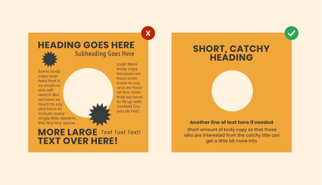
1. Less is More
White space is your friend. A busy design is overwhelming and hard to read. Create focus by limiting your color palette, reducing text, choosing at most 2 fonts, and ensuring images are only used if they add value to your message. Look for ways to solve by removing elements, rather than adding. Let your design breathe!
2. Be Consistent
Searching and manually adding your organization’s fonts, logo, and color palette every time you create a design is a pain. A valuable tool within Canva is the ‘Brand kit’. The brand kit serves as a functional style guide, allowing you to store all your brand assets in one place. This saves time and ensures a consistent look across all your designs, making them feel more professional. No more having to memorize hex codes or compare if the font is close-ish.
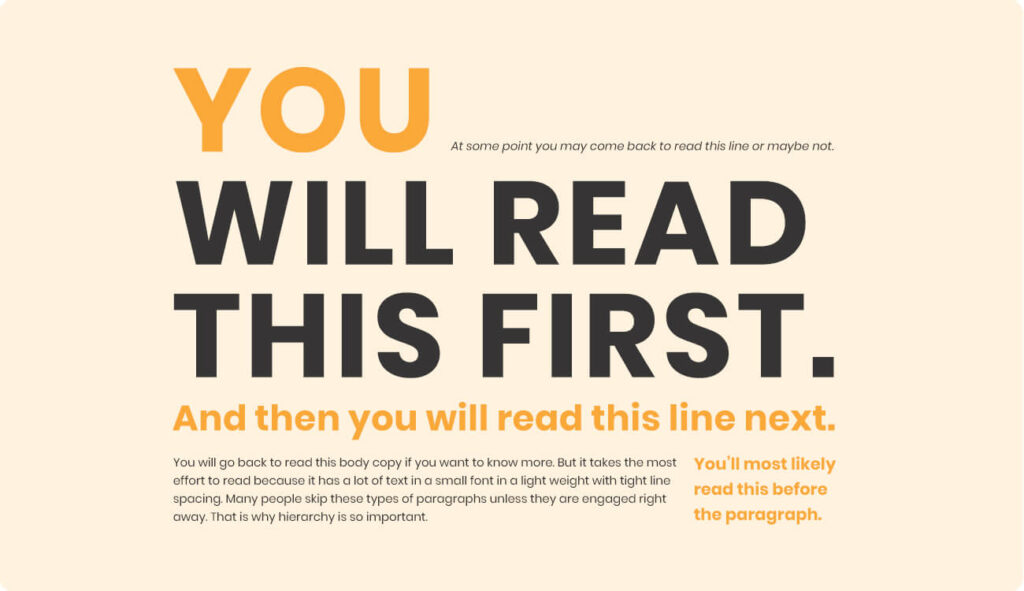
3. Don’t Forget About Hierarchy
Visual hierarchy is how you arrange elements to communicate their order of importance. It’s like the volume knob on your stereo ensuring balance and that your audience effectively hears you.
Not everything can be the same size and color. For example, the text styled as a title is the first thing your viewers should read. Therefore, the title should be the largest and most eye-catching text on the page, taking into consideration the natural way people read.
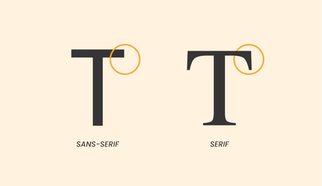
4. Stick to Serif and Sans-Serif Fonts
Try to use 1-2 fonts per design: one for the title and one for the body copy. Stick to using serif and/or sans-serif fonts, and avoid using handwritten and script fonts. A fun way to remember the distinction is sans-serif fonts are the ones ‘sans-socks’ – font styles that don’t include the decorative lines at the end of each stroke – whereas serif fonts include socks, the little decorative lines at the end of each stroke.
5. Learn Keyboard Shortcuts
Keyboard shortcuts are efficiency’s best friend. There are a ton out there, but the most useful to get you started are:
- Copy and paste: cmd/ctrl + “C” and cmd/ctrl + “V”
- Undo action: cmd/ctrl + “Z”
- Bold text: cmd/ctrl + “B”
- Group elements: cmd/ctrl + “G”
- Send elements/layer forward: cmd/ctrl + “]”
- Send elements/layers backwards: cmd/ctrl + “[“
- Scale elements proportionally: alt + drag a corner
- Duplicating elements: alt + drag entire element
Custom Canva Designs for Nonprofits
Let’s say you’re launching a communication strategy to share blog posts on social media to drive traffic to your website. openbox9 creates a custom design for the social media post as a template in your Canva account. Each time you write a new post, log into your Canva account, make appropriate edits to the template and generate a graphic to share/tweet/post. Voila! You are more self-sufficient in your day-to-day communication needs, without sacrificing the consistency of high-quality branding and design.
There is much Canva has to offer as a tool to support your communication efforts. Contact openbox9 about designing Canva templates for your nonprofit.