When looking for inspiration, I often try to look beyond what we’ve done in the past and learn from what successful nonprofits out there are doing with their websites. More than just pretty sites, the ones that are truly successful have implemented a simple communication strategy in an excellent way. This tends to reach beyond any one aspect of the site – copy writing, design, or information architecture – it’s the cumultive effect that everything has on the user that makes these sites work. In the end, they do a fantastic job of making their mission personal to the user, tell a story, or make complex issues clear.
I’ve gathered three examples of nonprofit sites that I’ve found inspiring.
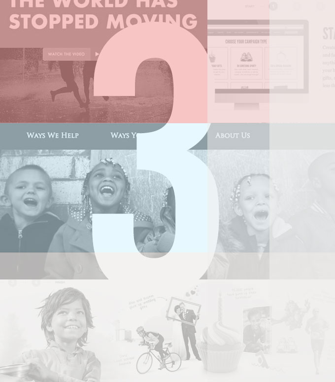
1. Make it Clear: Salvation Army
For such a large organization doing a massive amount of work, Salvation Army’s site does an impressive job of boiling everything down to 3 main navigation items.


2. Tell a Story: Designed to Move
Designed to Move is an initiative put on by multiple private and public organizations to fight physical inactivity. What this site does well is tell a story – why physical inactivity is bad and how it impacts the world. Fairly minimal compared to most sites, this one makes use of scrolling to take the user on a journey, letting the copy take the spotlight.


3. Make it Personal: Charity Water
There are plenty of clean water projects and nonprofits out there, but Charity Water stands apart in the way they make their mission personal to the user, and invite them to be a part of their work.


These sites do a great job of approaching audiences in a way that brings clarity, engages users, and makes nonprofit work personal. They are wonderful examples of what happens when organizations keep the what’s important at the forefront of their website project – the mission they’re serving and the audience they’re trying to reach!