
The skilled team at openbox9 regularly crafts beautiful brand systems, websites, and marketing materials. But some team members get especially giddy when a client dumps out a shoebox full of spreadsheets and challenges us to wrangle their data into something equally beautiful. Our love of data wrangling for visual storytelling begins when…
1. Organizing Raw Data for Design
Before data can shine, it needs structure. We bring rigor and consistency to unruly spreadsheets, often consolidating multiple sources into a clean, curated foundation. That means unifying naming conventions, correcting formatting inconsistencies, and consolidating/expanding categories. A tidy dataset becomes the launchpad for all the creative work that follows.
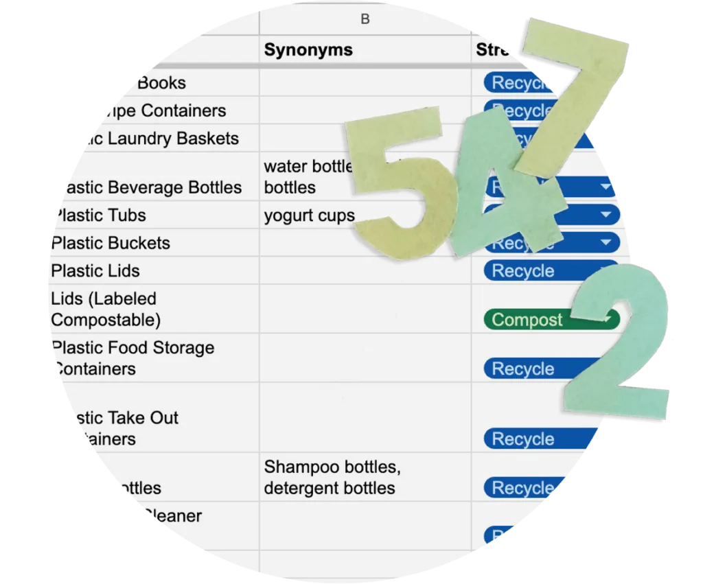
Stanford University
A set of spreadsheets with clear categories and cross-cutting relationships laid the foundation for the Waste Guide Tool helping people know the best way to dispose or up-cycle their waste.
2. Choosing the Right Visual Medium
Not all data wants to be a bar chart. We consider the story the numbers are telling and match it to the right visual medium—whether that’s a map to show geographic trends, an infographic to simplify complexity, or an interactive chart for deeper dives. When done right, the medium becomes part of the message.
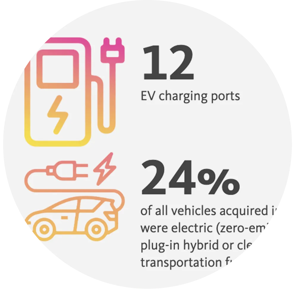
University of California
A collection of branded infographics was created for UC to showcase snappy data points so users could compare numbers across the many UC campuses making progress a positive experience.
3. Balancing Data Density and Clarity
Some audiences crave the full picture, and others just want the headline. We help clients strike the right balance between data richness and visual clarity. It’s a dance between offering enough information to build trust and insight, without overwhelming or distracting from the core message.
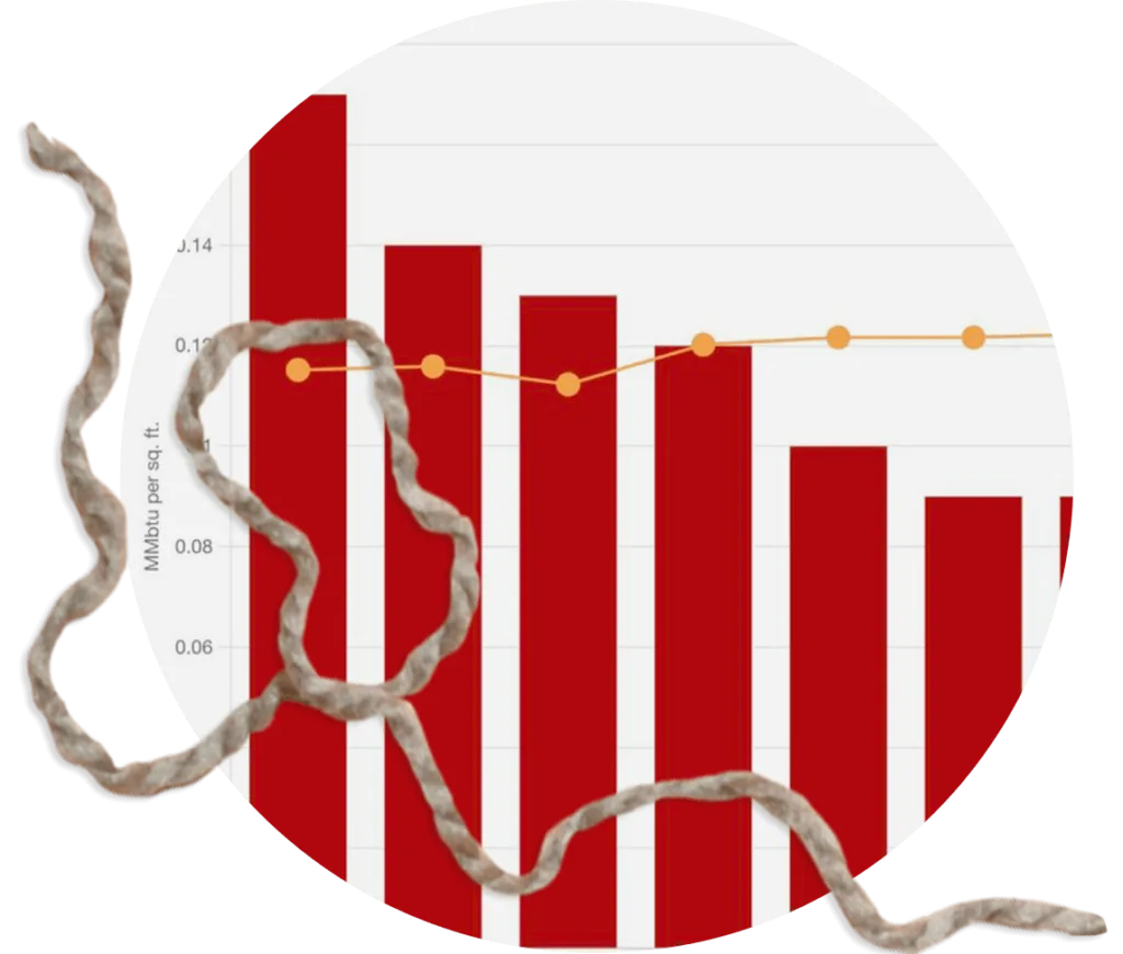
Stanford University
With a rich data set, Stanford had the option of building a Data Hub that was focused on the forest or the trees. Analyzing the goals helped direct the density of the visualizations.
4. Tailoring Visualizations to Your Audience
Data doesn’t live in a vacuum—it lives in ecosystems of people, priorities, and politics. We help clients differentiate between what belongs in a public-facing report versus what’s better suited for internal consumption. Sometimes that means softening a chart’s tone, or adding context that speaks to different stakeholder concerns.
Data wrangling can be dirty dusty work. When done well, it transforms raw, chaotic inputs into tools for clarity, decision-making, and inspiration. At openbox9, we believe beauty isn’t just in the pixels—it’s also in the patterns, the precision, and the purpose that emerge when data is thoughtfully wrangled.
Need help turning your data into powerful visuals? Let’s talk.
“Data Wrangling” is a term of art in the data science field. But it can be applied more generally to any organization with a message to tell with numbers.