
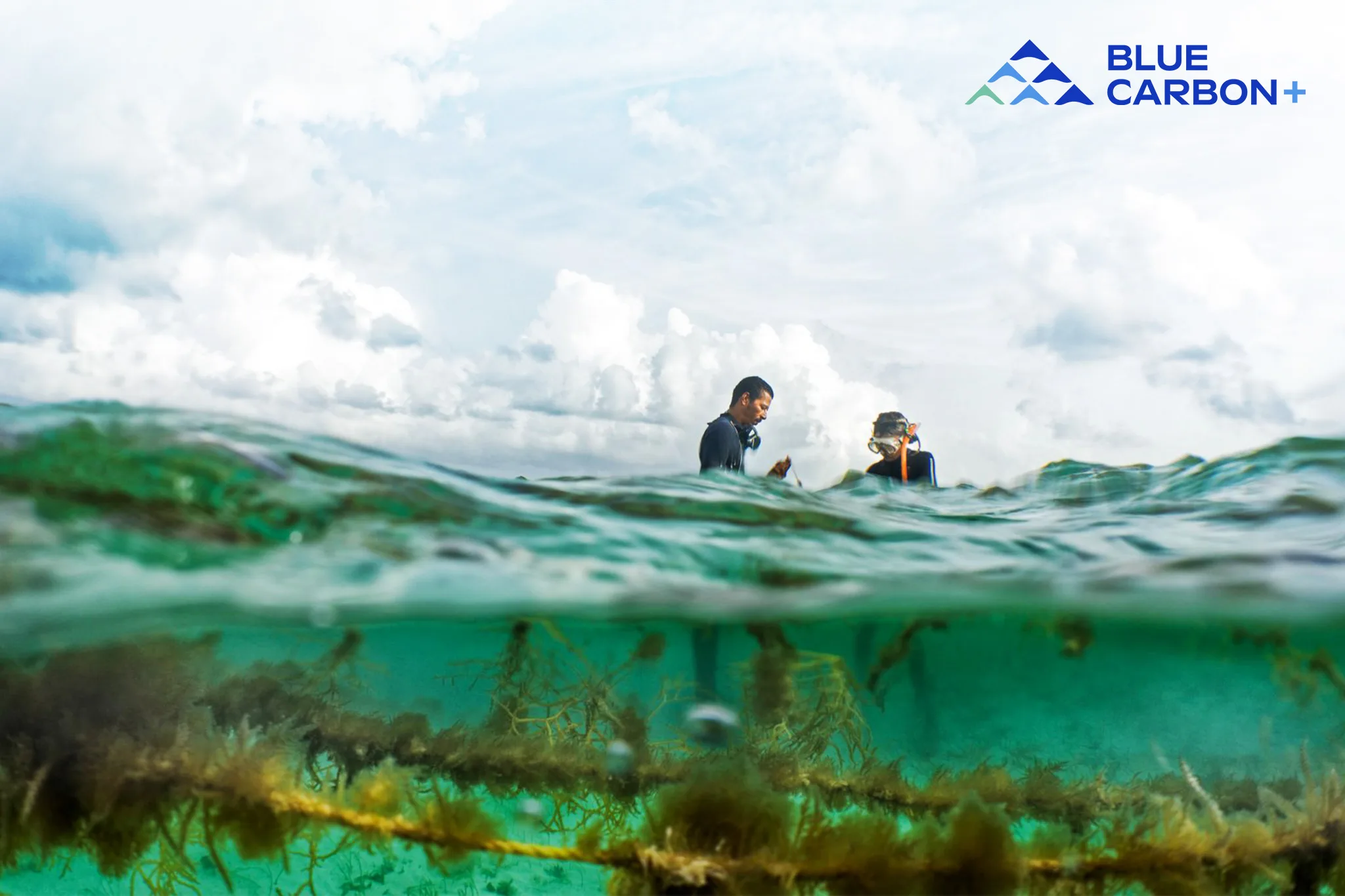
Blue Carbon Plus
Visually branding a fresh solution to an age old problem
At times it feels like we’re stuck choosing between a healthy environment and a thriving community — beast versus human, habitats versus Main Street. Along coastlines worldwide, this tension exists. But what if it didn’t have to be? Enter Blue Carbon Plus—a new initiative blending ecological solutions with economic opportunities. It’s all about creating win-win scenarios that support both the environment and coastal communities.

Positivity Meets Expertise
For a groundbreaking effort like this, the branding had to feel upbeat and approachable, while also showcasing the deep expertise of its two powerhouse partners: The Nature Conservancy and Conservation International.

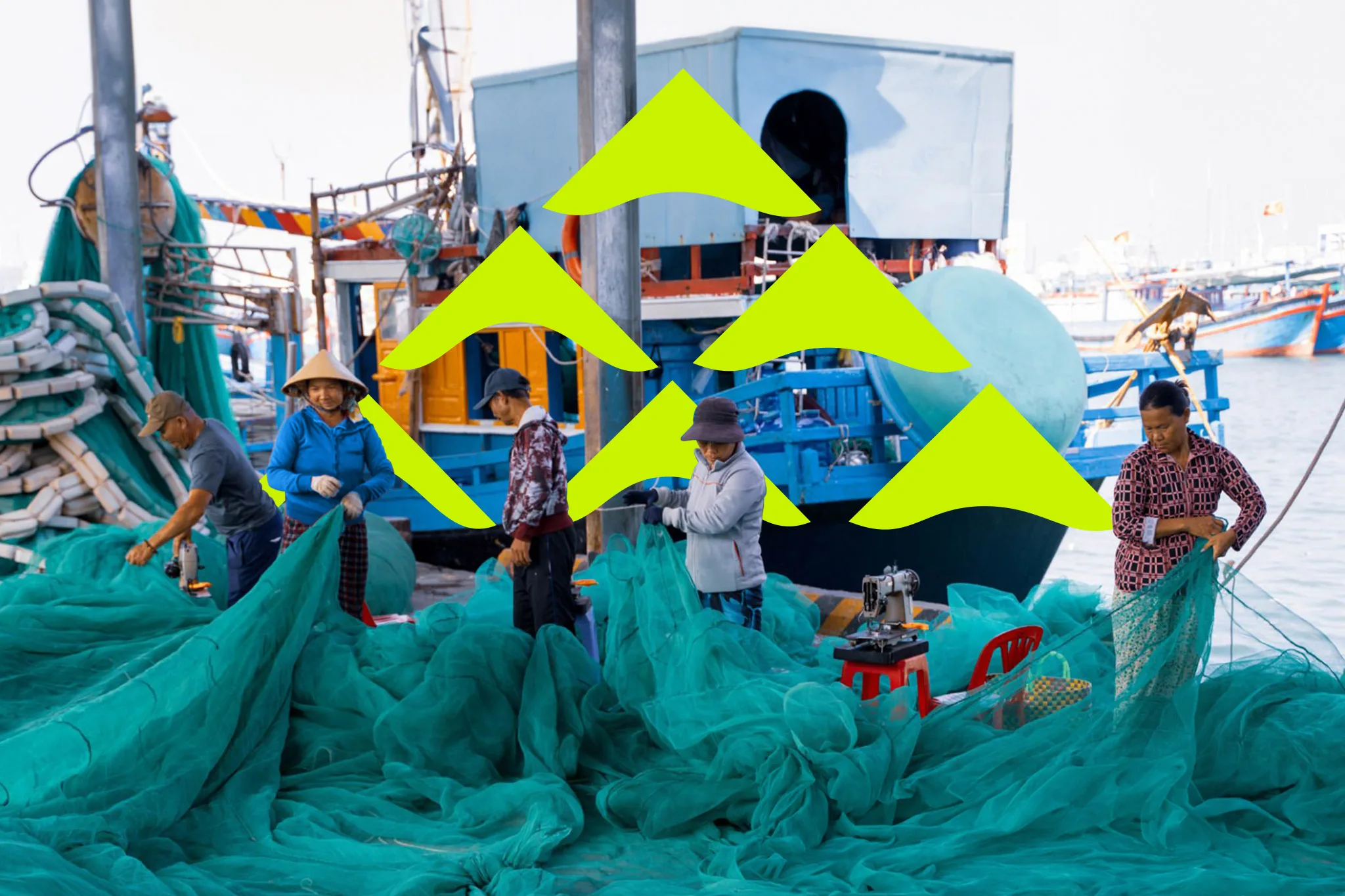
What makes this work so unique isn’t just the mission—it’s the focus on sea-faring communities. The branding needed to reflect that special blend of ecological stewardship and community care — honoring both recipients of BC+ work.


Why the Environmental Branding Works
Connecting people to the cause and bringing partners together to solve our carbon consumption, puts the plus in Blue Carbon Plus. Our starting theme of “Togetherness” explored the image of a school of fish symbolizing the collaborative effort along coastal regions. This concept represents ocean conservation while also appealing to investors and business owners by emphasizing growth and stability. The logo offers a unique perspective on addressing challenges and opportunities.

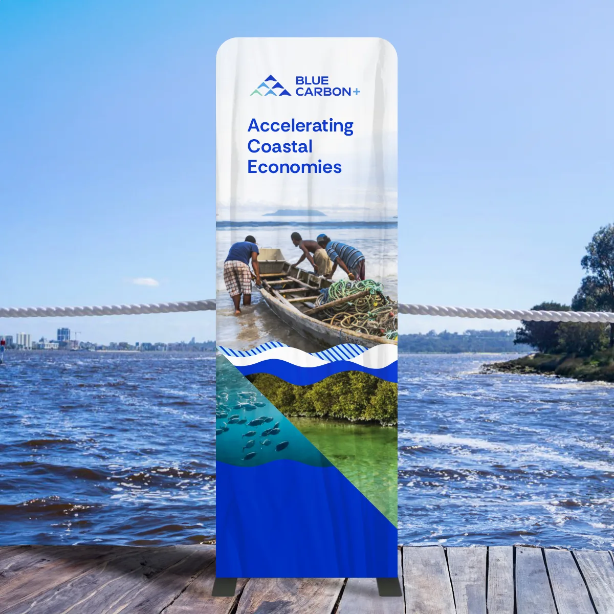
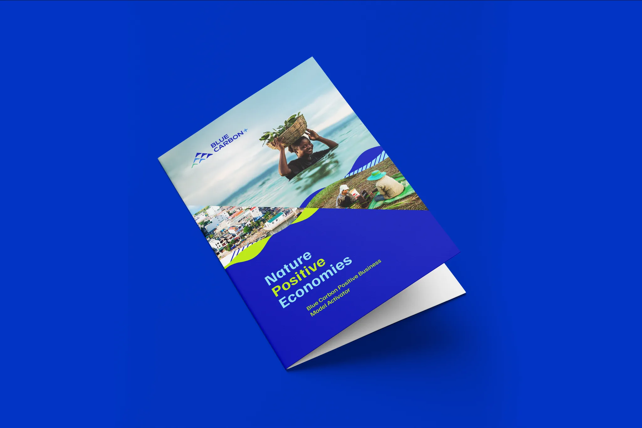
Our work included consultation on the use of the name; the tone of voice; and how the partners should be leveraged or not depending on the case examples. Along with consultation, we provided a suite of templates for the team to use in presentations, events, and social media.
As Blue Carbon Plus begins its journey to serve communities, the brand openbox9 has started will grow and evolve as the initiative grows and evolves. We are proud of the foundation that has been laid and look forward to Blue Carbon Plus succeeding… the Earth needs another hero.