
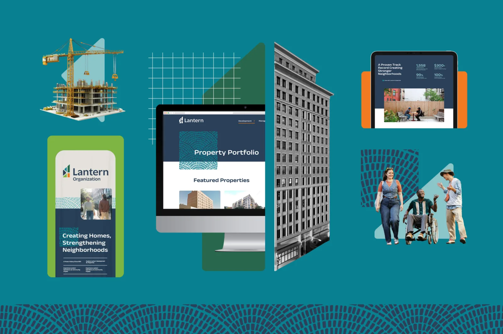
A Brand Trusted by Funders and Beloved by Neighbors
Client: A New York City–based developer of supportive housing, with 25+ years of experience as a community development partner
- Brand identity
- Custom Website strategy, design, and development
- Motion design and web graphics
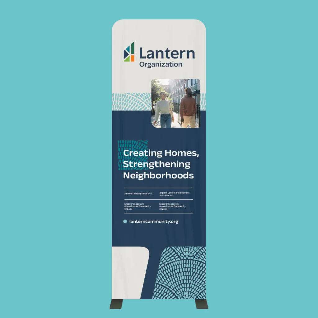
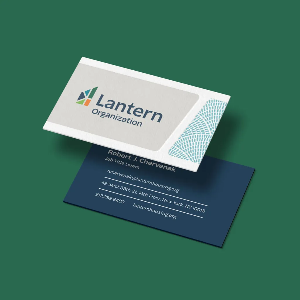
- Business collateral including letterhead and conference banners
Results: New brand system launched across digital, print, and environmental applications, unifying Lantern’s investor-facing and community-facing identity.
The Challenge: Financially credible. Genuinely human.
Lantern needed to communicate with audiences that have very different expectations. Investors and institutional partners needed to see an experienced, credible real estate development partner. Community members needed to see a trusted organization genuinely invested in the well-being of their neighborhood.
The challenge was creating one brand to earn the confidence of both. Lean too far into a polished, corporate real-estate aesthetic and Lantern risked losing the humanity of its community work. Lean too far into a traditional nonprofit identity and it could undersell its scale, expertise, and track record. The brand and website needed to hold both truths at once: financially credible and genuinely human.

The Approach: Accessible Confidence
Discovery & Strategy
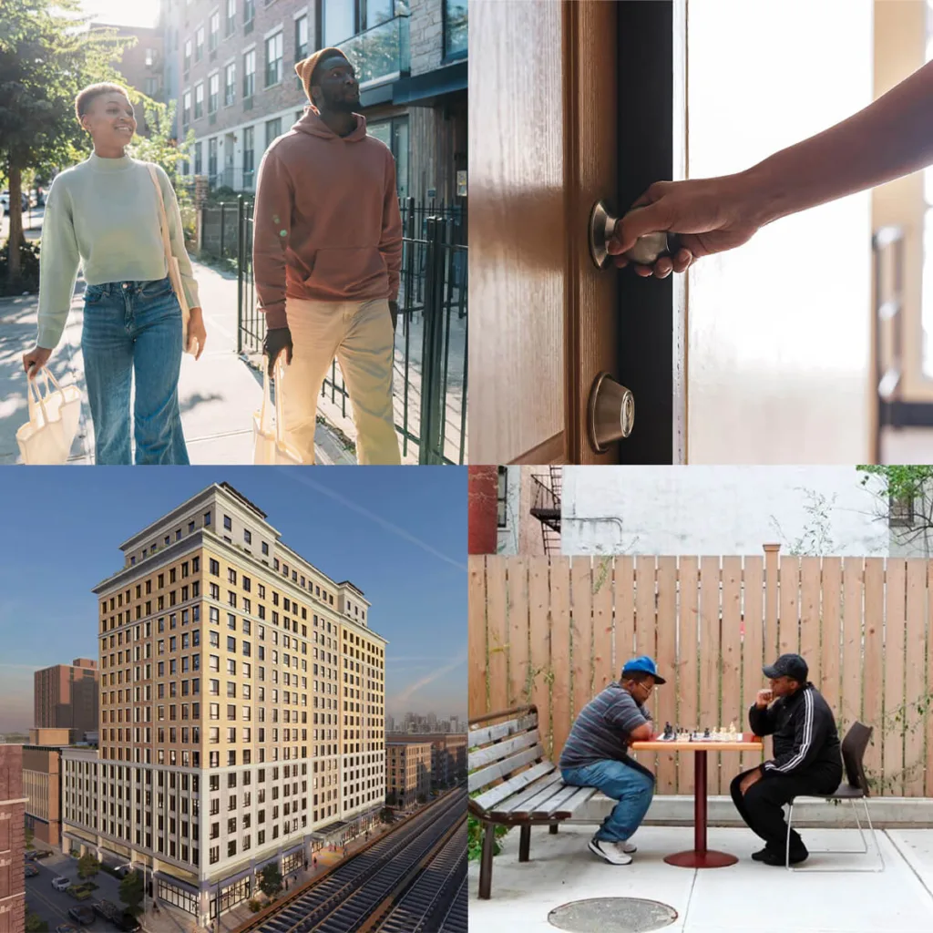
openbox9 identified the partnership between investors and local communities as the organizing idea, rather than a problem to design around. The strategic direction called for a visual system that felt bold, strong, and deeply human: confident enough to stand alongside institutional and investment partners, warm enough to reflect Lantern’s on-the-ground work with residents and neighborhoods.
Information Architecture & Content Strategy
The website structure created a shared space where both audience types could connect to Lantern’s reputation and impact – what does it feel like to partner with Lantern? Using a Portfolio of projects, Lantern can speak to the audience’s need for due diligence while connecting to stories and community impact that keep the human mission visible.
Design & Build
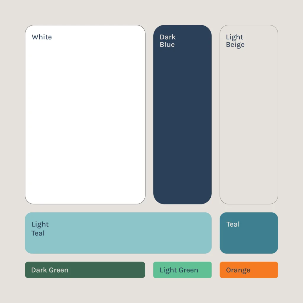
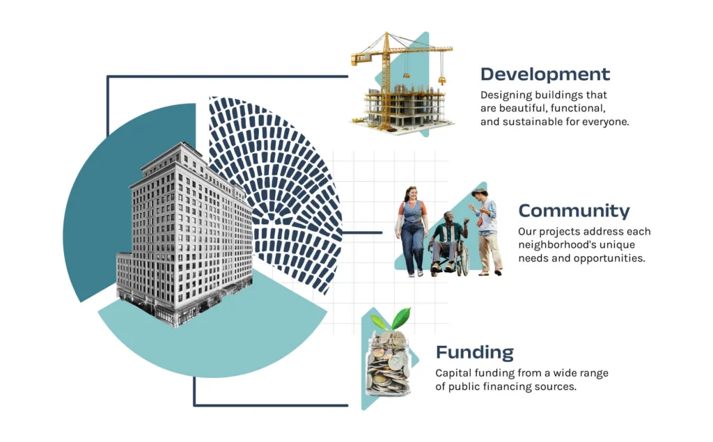
openbox9 delivered a full brand identity system — logo, color palette, and photography direction — designed to be approachable and credible. The system was extended into the mobile-responsive website featuring motion design. Supporting deliverables included infographics that translate program impact into visual data, environmental applications such as signs for events and conferences, and print collateral including business cards.

Deliverables
- Brand identity system: logo, color palette, photography direction
- Responsive website with animated homepage
- Program impact infographics
- Environmental display: tension-fabric for event and conference signage
- Print collateral: business cards
- Brand messaging and voice direction
- Extension of the identity to Lantern’s social-service subsidiary, Lantern Community Services


Results Over Time
Lantern’s new visual identity unifies their full range of communication — from investor-facing development materials to community program collateral to its social-service subsidiary, Lantern Community Services. The rebrand gave Lantern a single, coherent system that can present a data-driven track record to institutional partners and a warm, human story to communities, without those two audiences feeling like they’re looking at two different organizations.
“It was a pleasure working with you on this.”
Dan Kent, President/CEO, Lantern organization

Is your brand trying to connect with multiple audiences?
See how openbox9 builds nonprofit brands and websites around complex audiences
Services: Branding | Logo | Print
Sector: Supportive & Affordable Housing Development
Year: 2025