
A solid 40% of the office is a die hard fan of Stranger Things (sad, I know) and you can only imagine the hype the four of us share (yes, our office is small) when we talk about the upcoming premiere of Season 2 debuting at the appropriate time of October 27th, just in time for Halloween.
There’s something about the show that hits you right in the nostalgic why-aren’t-we-living-in-the-80’s type of way. Stranger Things is a homage to the 80’s, drawing from beloved classics like the Goonies, Stand by Me and Lost Boys. We’ve come a long way in the past 35 years, where the Madonna-listening-teased-hair-phase seems like centuries ago. To think that our everyday necessities – Netflix binging, Google, GPS – didn’t exist at that time makes us realize how fast technology progresses. The contrast between life in the 80s and life now only makes it so much more important to get the details of that era right and Stranger Things draws from every aspect of the period. If it weren’t for the nail-on-the-head-80s-aesthetic, the show wouldn’t be as popular as it is today.
Let’s take a look at a couple of essential design elements supporting my theory that we should thank designers for the success of this show (slightly kidding):
Logo

I’ve skipped many intros in my life, but this is one that cannot be missed. Take 58 seconds to soak in the 80’s synthwave music paired with the eerie glowing red titles:

For the typography nerds out there, you might recognize this logo as a modified version of ITC Benguiat created by Ed Benguiat. Benguiat created the font in 1978 and has designed over 800 typefaces in his lifetime (mental! I know), including type for Twin Peaks and Superfly which were popular in the 70s and 80s. The ligatures and y-height have been modified to fit the composition of the lettering. You can appreciate the letters in the intro, essentially each letter of “Stranger Things” zoomed in at 1000% while slowly colliding in with its ligature. The emphasis on the typographical use in the intro is a reminder of how 80’s graphic design is implemented throughout. This font has been graced in a number of Stephen King novels which were, surprise surprise, very popular in the 80’s, like these:
Color
Stranger Things has two very distinctive categories of color palettes: the warm, soft muted tones and dark, glowing contrasting colors. The softer colors are represented in the regular, present world vs. the dark colors which are represented in The Upside Down. The muted colors are almost identical to the color palettes from these classic movies from the 80s.

Top Left: Stand By Me (1986)
Aside from the strikingly similar scene, the use of color is muted, especially with the green tints.
Top Middle: The Shining (1980)
Use of warm tones and floral patterns mimic the aesthetic of the 80’s. Solid blacks are avoided.
Top Right: 16 Candles (1984)
Actors are styled with warm tones and pastel colors. Skin tones are always rose-colored and soft.
Lighting
Whether we’re welcomed with the glowing neon lighting in the intro, the rainbow Christmas lights juxtaposed against the dull floral wallpaper, or the green lighting in the CIA testing center that once was Eleven’s home, the lighting replicates that of horror and science fiction films from the 80’s. It’s interesting to note the darks are never 100% black and the whites never 100% white. Hints of yellows, blues, and greens replace the pure whites and blacks used in film today.

Top Left: Nightmare on Elm Street (1984)
Dark blues and greens were a common color palette for horror films in the 80’s.
Top Middle: E.T. the Extra-Terrestrial (1982)
The glow of bright lights is blinding against its environment.
Top Right: The Goonies (1985)
Stark shadows against vibrant gold colors are other-wordly.
Print design
Netflix is proudly throwing it back to our favorite films and has produced a number of series of posters based on some famous works.
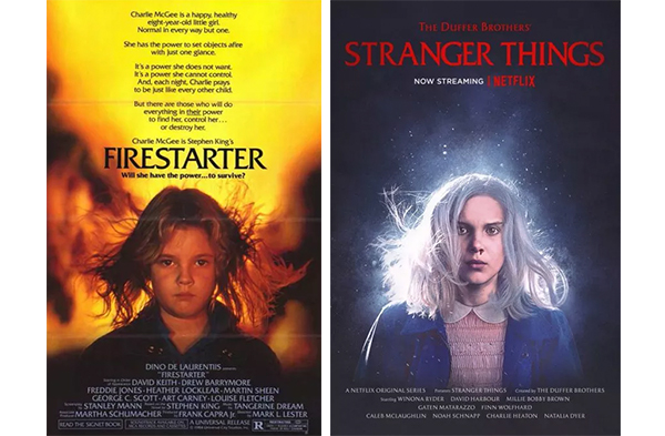
Firestarter, 1984
Similar use of font with a centered composition. The consistent glow in the lighting from the show is used in the poster and compares to the background in ‘Firestarter’. Colors differ in that Stranger Things keeps its branding consistent with the reds and deep blues.
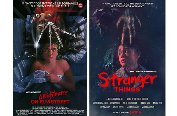
Nightmare on Elm Street, 1984
It’s interesting to note that similarity in use of type. The leading and kearning differs, but composition remains the same.
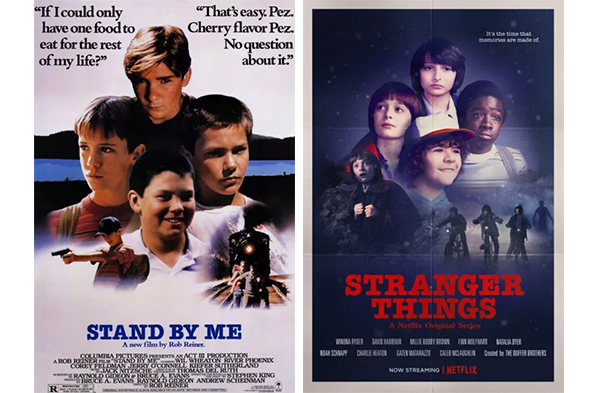
Stand by Me, 1986
You gotta love your old school, washed out masking of each character. This poster aesthetic truly replicates design trends in the 80s.
More can be viewed here.
All of this is to say that Stranger Things is doing it right. Successful design means persuasion. In this case, the fundamental elements of design are applied and carefully executed to produce a brilliant Netflix series that not only is aesthetically pleasing but is convincing enough that after 10 hours of binge watching the series, you’d forget you’re living in the year 2017 (guilty – speaking from experience). The connection to the 80s through design brings back a nostalgic feeling that is comforting to those who haven’t even grown up during that wonderful period, (guilty… again).
Happy Halloween!