It’s that special time of the year when scream-tracks, specters, demonic children’s toys, and creepy crawly things get their time in the spotlight. The horror film genre holds a special place in the hearts of US creepy-crawlers across the nation and has produced bone-chilling artwork. Here’s a line-up of the best movie poster designs and why they’re effective at quickening your heart rate and making your arm hair stand on end.
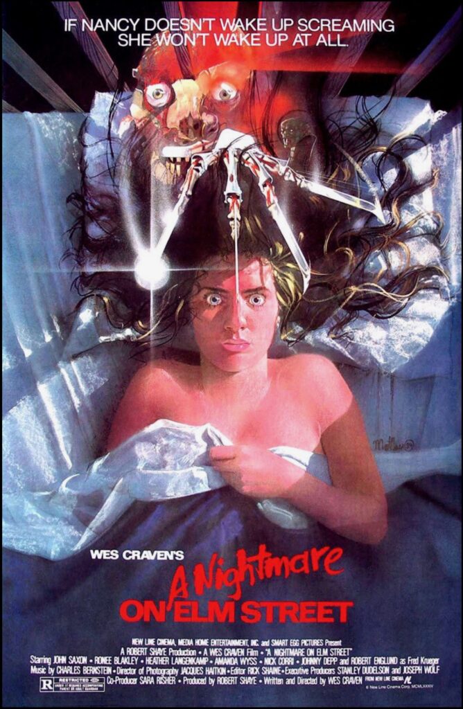
1. A Nightmare on Elm Street (1984)
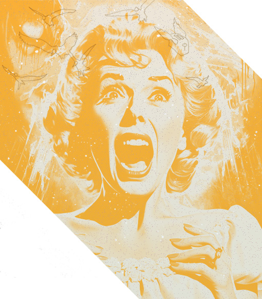
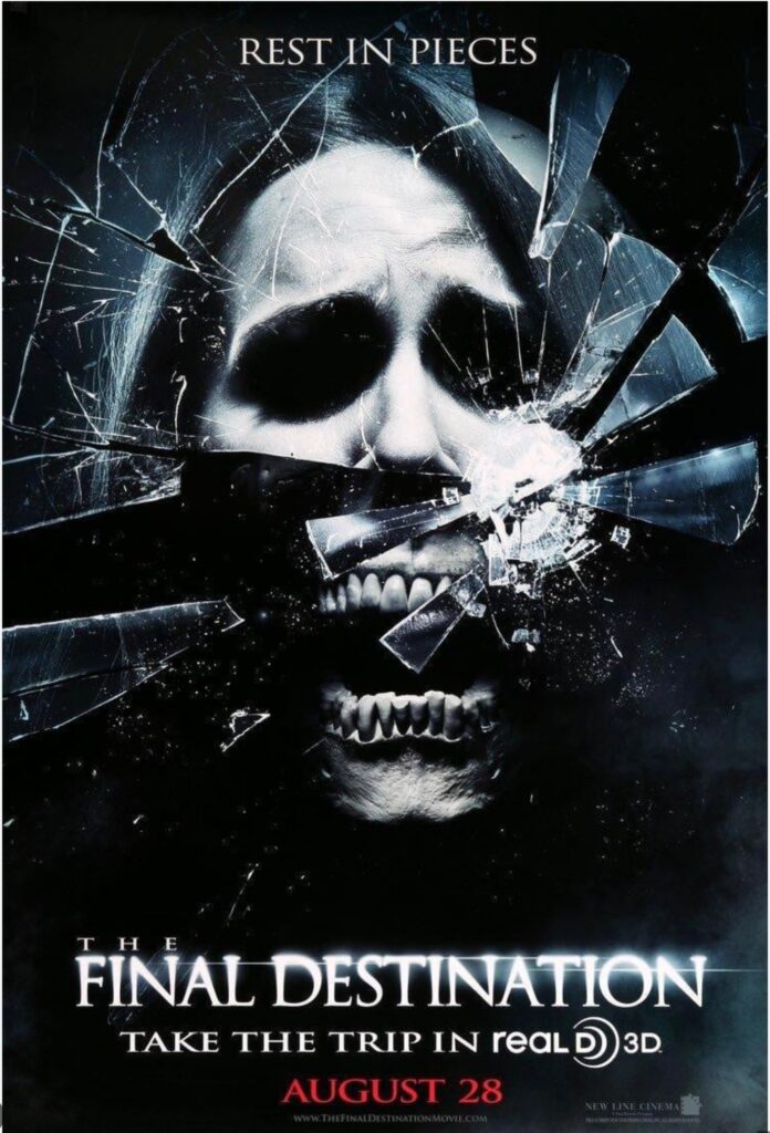
Me when my alarm doesn’t go off and I’m getting a suspicious amount of sleep.
Starting with one of the most iconic promotional posters in the horror genre, viewers are captivated by the frozen look of horror plastered on the main character’s face. That perspective makes you sit up and feel part of the impending scream. The film poster’s illustration includes a bold color palette in which red, warm elements catch our eyes first, and our attention is immediately drawn to the feverish hues of the main character, the ghastly Freddy Krueger figure.
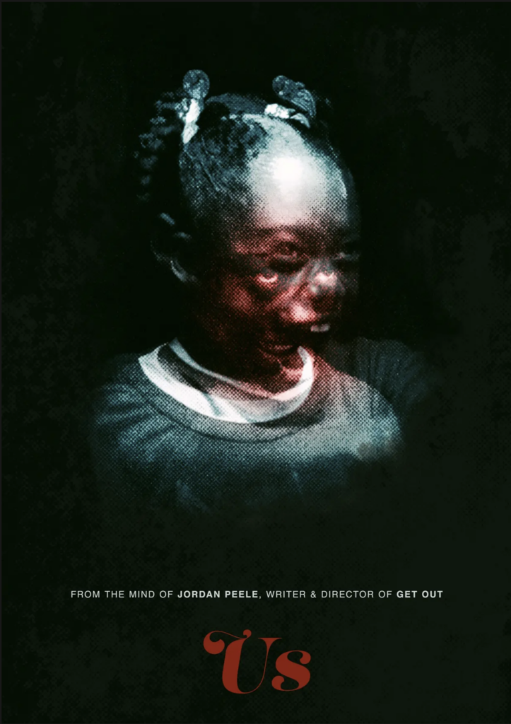
2. Us (2019)
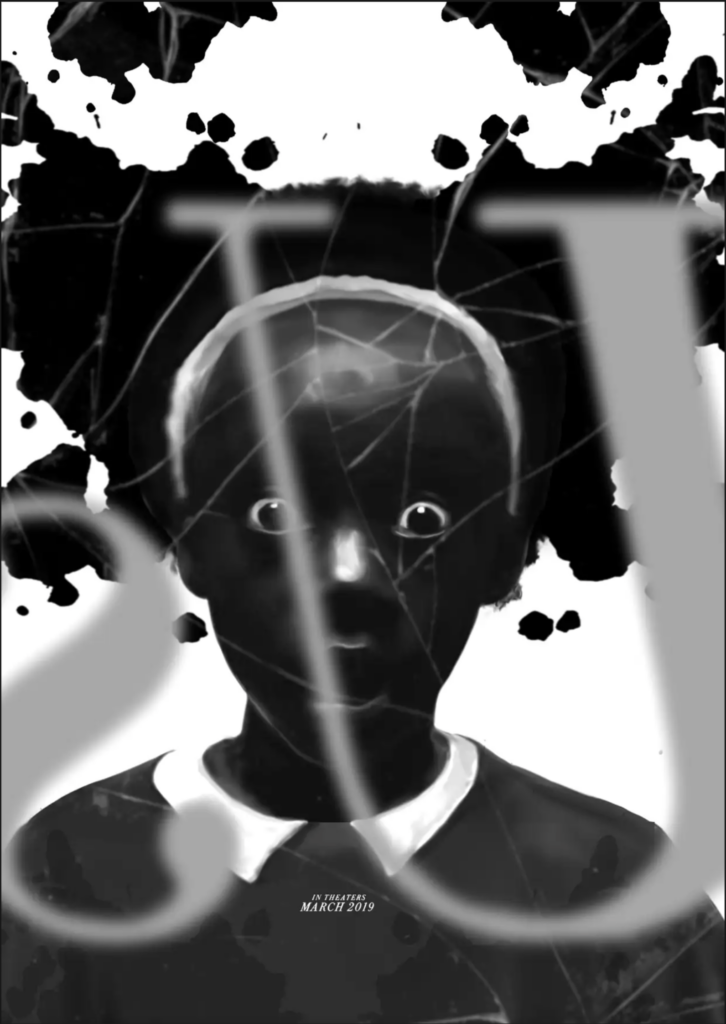
Though not the official promotional artwork for the 2019 hit film, this one holds first prize or terror in my heart. The artwork takes inspiration from a central scene in Us, where the main character is looking into the mirror and finds something disturbing (no spoilers in case some of you rock-dwellers haven’t seen the movie). This poster portrays the perspective of the viewer as a participant in the artwork; we’re on the other side of the mirror! The almost symmetrical rorschach inkblot also hints at psychological themes within the film. With little textual hints, this poster screams horror.
3. The Exorcist (1973)
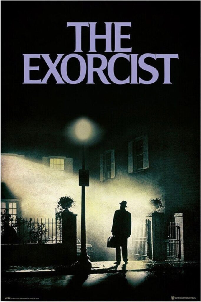
Hailed as the scariest movie of all time, the poster entices viewers while concealing the horrors within the film – an eery calm before a storm. While there is plenty of gruesome imagery that could have been used, the artist Bill Gold uses restraint, focusing on high contrasting imagery, a thick, ominous Georgetown mist, an eerie unnatural glow, and a lone figure to create an aura of anticipation, uneasiness, and curiosity. Nerdy designer fact: The title’s font, “Gemini”, and its story are derived from the 1971 novel of the same name.
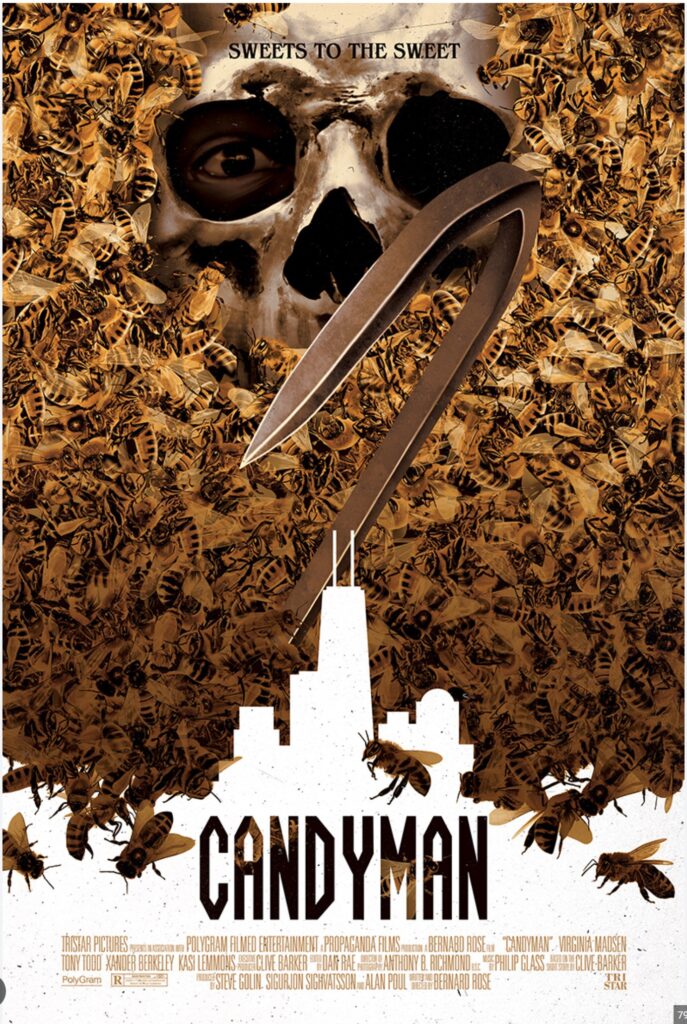
4. Candyman (1992)
Candyman, candyman, candyman, candyman, candy- aaahhhhh!
Just kidding.
My deep love for this film and its renditions draws me into this poster’s chosen portrayal of our “villain” – the son of an enslaved man and victim of a brutal and unjust murder due to an interracial relationship. Candyman takes on a dual-roles, one as a murderer, the other as a protector of Cabrini Green, a majority Black community in modern-day Chicago. The poster features Candyman over a skyline representing Cabrini Green, positioning him as a protector. Candyman’s expression, a lone eye within a skull, carries a lot of weight in understanding the character. Rather than menacing, the expression comes across as fearful and lost, adding to the complex identity and murderous motivations of our antagonist.
Nope (2022)
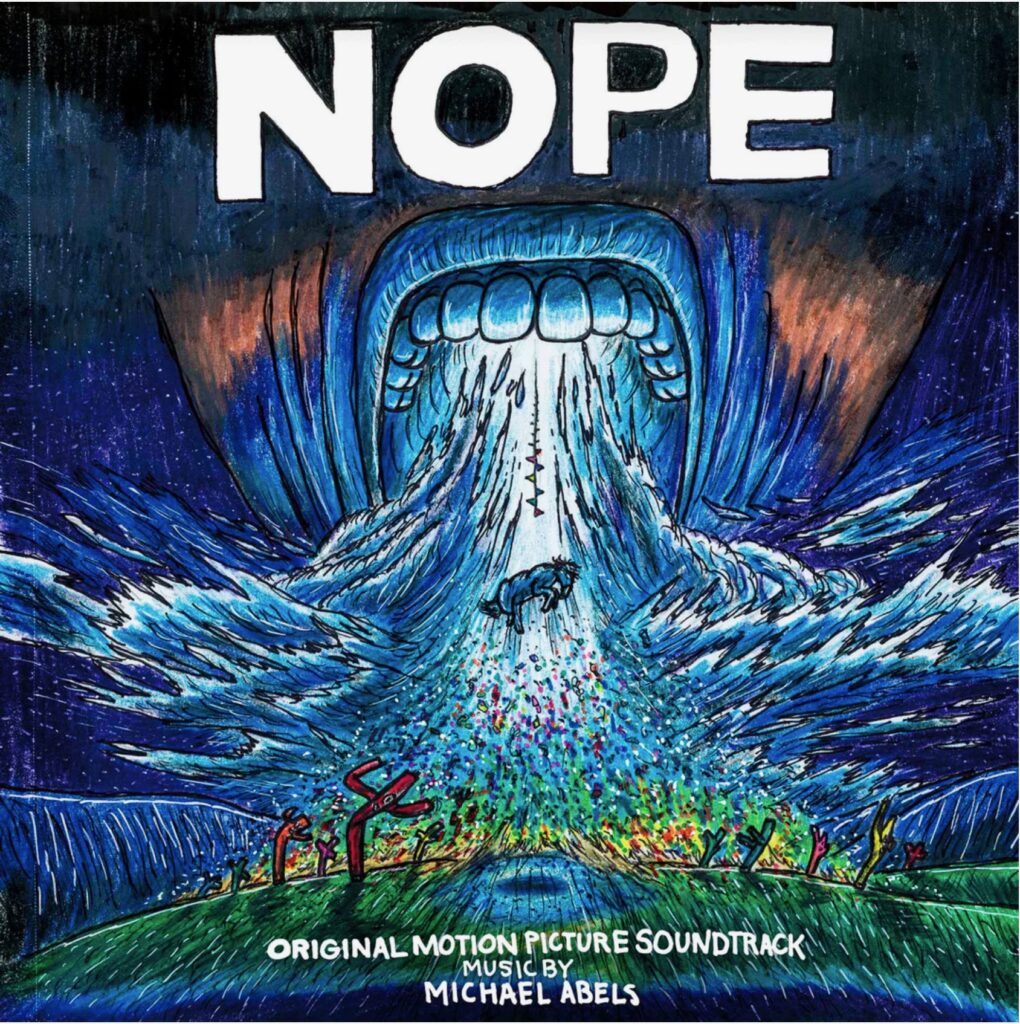
Not a poster, but a vinyl cover for the film’s soundtrack, this artwork conveys the intense high-energy pace of the film. The dark blues are used in most of the film’s promotional materials and important elements within the film (like the horse, the inflatable tube men, the colorful flags) are included in the album cover. The movement in the design works to draw viewers into the ominous mouth. The hand-drawn crayon texture also adds to the chaotic composition, creating unease and unsettled expectation by the viewer.
Honorable Mentions
Need a branding agency that understands how design creates emotional connections with your audience (whether spooky or not) – contact us and let’s get haunting.