As people who work for mission-driven organizations on tight budgets, you probably don’t feel like you have a lot of extra cash to spend on fancy high-end fonts or licensing fees. So you end up using the same old and tired Arial or Times New Roman. But it’s 2017, and times have changed. Luckily, so can you.
Even a decade ago, to find and use free fonts that were any good was challenging. However, these days you don’t have to look too far to find free fonts – they’re everywhere. And that has caused its own problems as many of the fonts circulating on the internet are mediocre at best. So how do you know if a font is “good” or not? And how should you choose?
Fonts can be subjective, and crowning a few “best free fonts” is all but impossible. However, the font families that we select for clients are ones recognized as being high quality. They weren’t made in an afternoon with some online build-your-own-font program.
Good fonts have been tested and refined so that the kerning doesn’t look like this:

They have multiple font weights (ie. Regular, Italic, & Bold) so that words can be emphasized and articles properly italicized.

They are well-crafted so that letter style is consistent, spacing between all letters is even, and words are easily legible. They can look good in small sizes or as giant letters on a billboard sized poster.

They are versatile – able to be used effectively both in print and on the web.
Once we find the good ones, then we tailor our choice to your message. Is the font being used for a gala event or for a handwritten note? Does it share characteristics with your own brand identity? Does it subconsciously communicate the same message that you are trying to tell through the words it spells out? That’s where our secret sauce comes in, and our experience can help you to find the right voice for your communication.
Our Picks
Here’s our list of typefaces that we often use for our clients, all of which (except one!) can be found in one location – Google Fonts. This repository is a great resource that is simple to use and features many great fonts. These can be downloaded for print projects or hooked directly into your website to display there.
Sans-Serif

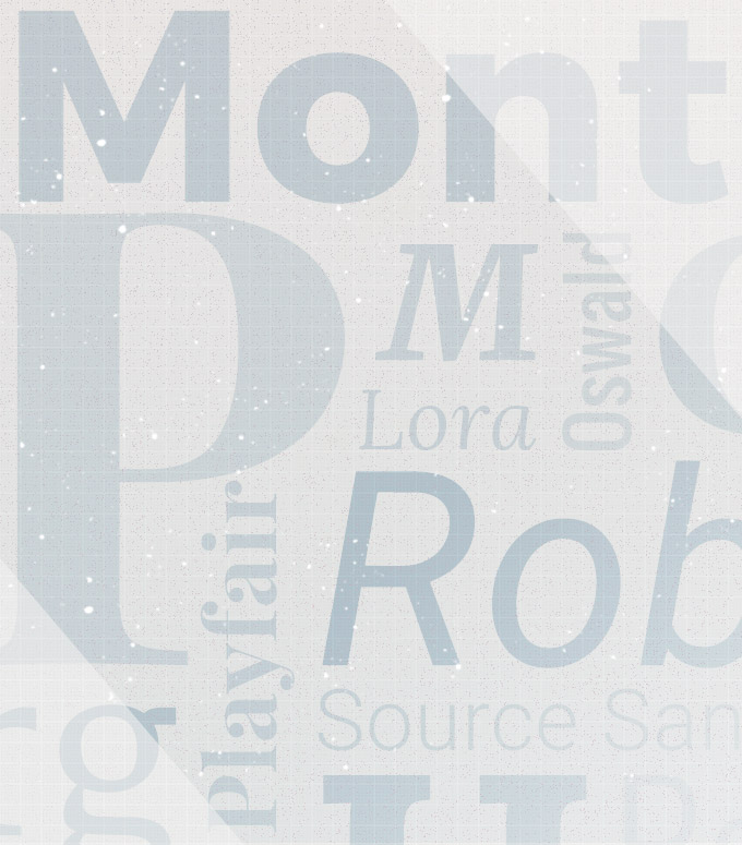
Roboto
A no-nonsense, structured geometric font, with a bit of approachability. This was developed by Google and is used as the primary typeface for the Android operating system. It’s a great general use font for the web, both for body copy or headings. Roboto also has a huge family – from Thin to Black weights, as well as Condensed forms.
Source Sans
A refined, humanist sans-serif option, designed by Adobe for user interfaces. It is inspired by other Gothic typefaces such as Franklin Gothic and News Gothic, and was made with legibility in mind, both for long passages as well as labels and headlines. Source Sans has some interesting quirks for a sans-serif font, such as l’s that curve up at the end, to easily tell the difference between a 1, I, and L.
Montserrat
A modern, bold, geometric font with a hint of playfulness. Stylistically, it is often compared to the well known typeface, Gotham. It is great for headings or callouts that demand attention. Fun fact: it is named after the Montserrat neighborhood of Buenos Aires, Argentina, where the type designer lives. It takes cues from the hand-drawn lettering of old posters and signs.
Oswald
A modern-looking condensed font, great for making a statement or fitting a lot of text into a small amount of space. Though space saving was originally the main use for condensed fonts, these days they are more often used for a visual break from standard text. Oswald does a great job adding a refined spark to a page, but should be used sparingly.
Lato
A versatile font with semi-rounded letters. While at first glance Lato is a fairly serious sans-serif font, there is a sense of warmth that comes from the gently curved edges and little quirks. Fun Fact: Lato means “Summer” in Polish.
Serif

Merriweather
A sturdy serif font designed for the screen. It has a very high x-height (the height of the lowercase letters), which help its legibility and gives it a more modern look. One note when using Merriweather – keep it a point size or so smaller than what you normally would since it tends to display larger than the average font.
Playfair Display
If you want something fancy, this is a great heading font. With its high contrast between thick and thin points, it isn’t as good for long paragraphs of text, but it makes a bold and elegant statement in a title. It would look right at home on an invitation to a black-tie event.
Lora
A beautiful, flowing font, especially the italic versions. Lora has hints of calligraphy in its letterforms and flows very nicely from letter to letter. It is especially well-suited for body text since it is balanced and legible.
Georgia
Good ol’ Georgia. This one is most likely on your computer already, since it is a standard font that comes with Microsoft and is one of the original web-approved fonts. Still, it really is a great typeface, and often used for body copy on websites. It was designed to be legible at small sizes on a screen and it holds up today.
Final Thoughts
There you have it. If you want to step up your next project design with a more memorable and professional font, or you are just tired of using the same defaults, choose a well-made font from this list. You can’t go wrong and it won’t cost a thing.
This list is just the start though. Using a font is more than just picking a compatible option. For a project to succeed, it also has to be implemented well. So, choose your font, and download away – but if you really want to make sure your choice speaks clearly, let us help you effectively communicate your message.