It’s official – 2017 was a horrifying year (in more ways than one). During the past twelve months, the greatest pop culture success stories came from under the bed and inside the closet. 2017 was the year horror dominated the charts. From the box office smashes of It and Split to the satirical bite of Get Out to prestige horror-ish efforts like The Killing of a Sacred Deer, it’s not hyperbole to call 2017 the “Biggest Year in Horror History.”
Given that prestigious accolade, what better time to look back at the classics that came first—with a very particular bent. After all, design and film aren’t so separate – both involve taking a concept or mood and making something an audience can connect with. So, what five genre classics should every designer see?
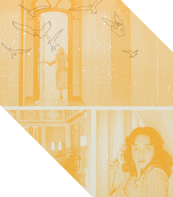
The Shining – The Devil’s in the Details
Stanley Kubrick remains cinema’s most famed control freak, obsessively attuned to every detail in the search for the perfect frame. As designers, we can look at his work and see how small, precise details are more than just extras – they’re the pieces that make up the whole.

Kubrick saturated his film with a remarkable attention to detail, including:
- Designing spatial impossibilities in the sets of the Overlook Hotel
- Insisting that the iconic “All work and no play makes Jack a dull boy” pages be typed in full and translated into four different languages
- Spending six months to get the right shots of the blood in the elevator scene (and much more)
As designers, we can make connections with our audience by embedding these same winks, and using them to reward truly careful attention. No moment is too small not to merit consideration.

The Innocents – Less is More…
In design, as in film, stripping away excess can let the content shine through. Adding bells and whistles might create flash, but if the root of the concept is strong enough, why dilute the message?

Take the 1961 British classic The Innocents, loosely adapted from Henry James’ novel The Turn of the Screw. Compared to the frantic gore of many contemporary horror films, The Innocents seems positively subdued. There’s no jump scares or blood spatters— just a growing sense of dread, something that starts innocuous and grows to near-unbearable tension. For designers, it’s a reminder of how we can convey mood and meaning by honing in on small moments, removing extra distractions, and letting the content speak for itself.

Suspiria – …Don’t Be Afraid to Go Big
Remember that thing about less being more? Not if you’re Italian, apparently. Suspiria is high giallo gore, perhaps best described as maximalist. This lush, lavish tale of a young ballerina in a remote German academy is a kaleidoscope of color, music, and violence.

As designers, it’s hipper than ever to go small, to be minimalist. While that is a perfect place to start, there are situations that call for excess. Just as extravagance for its own sake rings hollow, simplicity without cause can feel equally empty. Instead, we can celebrate the opportunity to turn up the volume – when the situation calls for it.

The Witch – Do Your Research
Sometimes, to create something that feels new, you have to turn to the past.

To create his eerie depiction of a Puritan family caught up in the grip of suspicion, director Robert Eggers used authentic dialogue from historical witch trials and shot with natural light and candles. Even the score used only acoustic instruments, and the majority of costumes were made with period-appropriate materials. The overall effect is more than scary – it’s immersive. It truly feels like you’ve stepped into another era, and that’s what makes it so chilling.
As designers, we often search for what feels new, innovative, and hip. The Witch is a reminder that sometimes the most shocking move is to look back.

Scream – Be In on the Joke
Wes Craven’s legacy in horror movies was well-established by the time he directed 1996’s Scream. What was so remarkable about that film was how fast and loose it played with the rules of a genre Craven himself had helped to define. After a near-endless parade of Scary Movie spoofs, it’s easy to forget the audacity in making a film that so gleefully referenced its own cinematic nature.

As designers, it can be tempting to take our work perhaps a tad too seriously. That’s especially the case if you’re working on a topic that seems serious, heavy, or somber. But one of the ways designers connect with their audience is through getting us all in on the joke. Even serious subjects can be treated with irreverence. Craven isn’t denigrating the genre, after all, but rather pointing out the key patterns we, as audience members, enjoy noticing ourselves.
