Web design, even more than other forms of design, is constantly evolving. It’s something we love about it. Limitations that previously constrained us are slowly disappearing and we have greater possibilities for wowing viewers. It’s required that we keep up with constantly advancing technologies and the multitude of devices created for viewing interactive content.
Here’s a list of six ways we embrace the expansion of web design:
Keeping it Short and Simple
[photo-frame] [/photo-frame]
Ever heard of the KISS principle? There are a few reasons web designers love it– website performance increase, maintains viewer interest, and makes your site look better. No one wants to walk into a crowded store where they can’t find what they want and are overwhelmed by the options. Likewise, your users don’t want to dig through a content heavy site. It’s important to think about why your audience is viewing your site and cut out the rest. It will make them happy. Focused words, clear actions, and organized information.
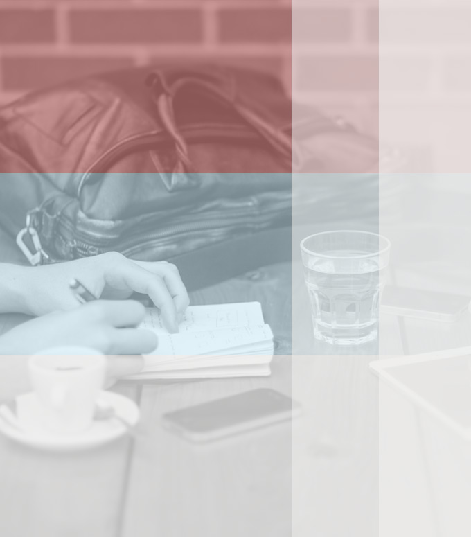
Adding Human Touch
[photo-frame] [/photo-frame]
In the past year web designers and developers have grown exceptionally good at minimalism. It is refreshing and a great way to keep things simple, but everything is starting to look the same. Getting rid of the superfluous creates room to add a human touch to make a website personal. Whether scanning in drawings or creating customized icons for your website, we will make it your own.
Making an Outstanding First Impression

It’s important to keep in mind how many people will be viewing your site on their phones and tablets. Rather than using a homepage as a starting point or road map, we like to think of it as an elevator pitch. We want to quickly catch the attention of your audience, tell your brand story, and leave them with a call to action.
Playing with Typography

Web designers have had the ability to render beautiful typography on the web for years. Resources like Google Fonts raise the bar for how we treat text on the web. This means focusing on readability by fine-tuning width, font-size, and line-height of our articles. It also means having fun with bigger fonts in titles and splash images.
Looking to Print for Inspiration

In addition to paying more attention to typography, we let print design inspire our website designs. There’s no reason web design shouldn’t be as breathtaking as print design. We like using photos and color schemes cohesively. We love buttons that aren’t three-dimensional. We’re not afraid of negative space.
Breaking out of the Box
[photo-frame] [/photo-frame]
Your user is already viewing your site within the window of their browser within their computer, tablet, or phone. We want to continue embracing full widths and avoiding any unnecessary borders and frames.
The way we view the web is still changing, so the way it looks should change too. Web designers have been doing a good job adjusting to technology by adopting responsive design and thinking of page load times. Now it’s our job to consider all the opportunities the responsive web gives us and our users.