Each year the international development nonprofit IREX gathers community leaders from all over the world and prepares them to tackle problems in their local communities. The inspiring effort is named the Community Solutions Program.
IREX came to openbox9 seeking a way to display their worldwide impact by displaying the leaders at work in their communities. What better way to show global positive change than on an interactive map?
Designing an interactive map presents a few complex questions for our strategy:
How do we brand this?
We wanted this map to not only work well, but also look great. While the map is for the Community Solutions Program, it is part of a larger organization—IREX. And it lives on the IREX website. We brought this together by using the neutral colors of the IREX brand as the map foundation and integrating the bright Community Solutions Program colors for the data. This, in combination with—make the map appealing and fun to use.
How much map are we really talking?
We wanted to visualize how far the Community Solutions Program reaches. At the same time, we did not want to lose sight of the individual leaders, programs, communities, and stories. We concluded that we needed three main levels of data.
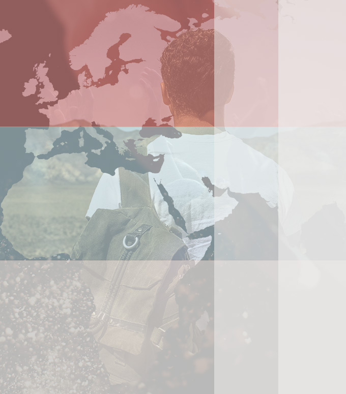
1. Worldwide: Breadth of Impact
Here we visualize the breadth of the program by showing how many beneficiaries there are and where they are located around the world. This quickly communicates that the Community Solutions Programs has projects all over the world.

2. Country: Kinds of Impact
Go a level deeper, and you can see the type of projects happening in any country. You can filter these at any time based on four main categories. These clarify what kinds of problems leaders are working to solve in a given country. Images of these leaders invite the user to learn more.

3. Project: Depth of Impact
By clicking on any pin, you get a unique story—something that can be more valuable than numbers alone—as well as the face behind the work. These stories and images are what really help the user draw meaningful connections between this program and it’s impact.

Each of these levels represents the data in ways that factor in the different types of information—numbers vs. stories. Together, these levels communicate the breath, variety, and depth of CSP’s impact.
What can we do within budget?
We needed to find a solution that fit within a modest budget. As is often the case, this led to taking advantage of resources like google maps. While it doesn’t give endless options, it provides a solid foundation for data visualization. We kept the limitations of google maps in mind throughout the design process to avoid promising anything we could not deliver within budget.
What are the hurdles?
With a little tweaking we can change the detail and colors of a map, but we found a few more necessary changes when using google maps. We knew we wanted to show images as pinpoints for each project. This highlights the micro level and personal quality of each community project. Unfortunately, if there are multiple pins in one location, google maps cluster them together—making it difficult to see all these thoughtfully crafted pins. Fortunately, we put on our problem solving hats and made it work. In order to keep the appeal of unique pinpoints, and still see every pin, we created an algorithm that automatically plots points around a center. Continuous prototyping and testing throughout the process helped us finesse the map functionality and avoid any unpleasant surprises close to our deadlines.

How do we make this adjustable and future-friendly?
Like most projects, we wanted to make this project a scalable one. The program gets new projects and more beneficiaries every year, so the client needed to be able to update the data easily and as often as they wanted. We factored this in and added the ability to update data by uploading their own spreadsheet.
Creating Engaging Solutions and Means of Communication
By carefully considering the clients needs, the multiple levels of information, and budget limitations, openbox9 created an effective way to visualize the projects and beneficiaries of the Community Solutions Program. The map not only shows the expansive reach of the program, but it also provides an enjoyable way to learn the stories of each unique project.
Could an interactive map help communicate why the world needs your organization?