
Outdoor brands have long relied on the mountain symbol to communicate adventure, resilience, and connection to nature. The result is an overwhelming number of mountain-inspired logos across the sporting gear and apparel industry. Some stand out. Many blend together.
As a nonprofit branding and design studio, we often study how visual trends evolve across industries. These patterns reveal important lessons about differentiation, symbolism, and the risks of relying on overused visual shorthand — insights that apply just as much to nonprofits as they do to outdoor companies.
In this review, we look at a range (pun intended) of mountain logos through the lens of brand strategy. What works? What feels generic? And what can mission-driven organizations learn when developing a visual identity meant to stand apart? At openbox9, we help mission-driven organizations develop distinctive visual identities and communication systems through thoughtful brand strategy and design.
Logos Receiving a D-
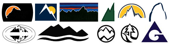
D stands for dull. The above logos are my least favorite because due to their obviousness “Oh, it’s an outdoor outfitting company…let’s put a mountain in the logo.” Half include reference to the sky behind the mountain. Logos are not illustrations. These logos have the essence of Wil E. Coyote – lots of spirit, but no real strategy. It’s the lack of creativity that’s really a shame here.
Logos Receiving a Solid B
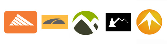
B stands for better. These logos are better executed and attempt something. Dated though some of them may be, they do offer a perspective – the idea may not have stayed long, but it did visit. Perhaps one of the logos above was visited by his cousin adidas.
Logos Receiving an A
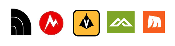
A stands for “alright!”. These logos may not be perfect, but if you had to have a mountain logo this is the way. These logos include originality in their view of mountain shapes (never mind one of them looks eerily similar to Motorola), and dare I say even some spunk.
Now if I can just get one of these companies to send me a free jacket I think that’d just about do it. Contact us, to offer free outdoor gear or, for your next logo design need.